Stop Using JavaScript for that!

Artikel uit Frontmania magazine 2024
Don’t worry, this isn’t a JavaScript-hate article. In fact I love it. I write bucketloads of it every single day. But I also love CSS, and I even love JSX HTML. The reason I love all three of these technologies is something called:
The rule of least power
It’s one of the core principles of web development and it means that you should choose the least powerful language suitable for a given purpose.
On the web this means preferring HTML over CSS, and then CSS over JS. JS is the most versatile language out of the three because you’re the one describing how the browser should act, but it can also break, it can fail to load and it takes extra resources to download, parse and run.
In contrast to JS, which is imperative, HTML and CSS are declarative. You tell the browser what to do, not how to do it. That means the browser gets to choose how to do it, and it can do it in the most efficient way possible.
But I need JS for that!
You might be thinking “All the things I use JS for, I need JS for”. That might be true, but it’s good to know that both browser makers and specification writers have been porting a lot of functionality over to CSS and HTML that up to a few years ago needed JS.
The solution you learned once when you did need JS for it will still work, but it might no longer be the best or easiest way to implement a feature. What I want you to take away from this article is that just because you know something needs JavaScript, doesn’t mean it still does.
Custom Switches
We’ll start this article off with something we’ve all had to implement at some point, custom switches. Instead of using a regular checkbox, the design calls for a nice looking switch. Rather than reaching for a JS solution with divs, onClick handlers and internal state, we’re going to make use of a regular checkbox and the :checked pseudo class.
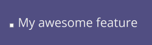
<label>
<input type=”checkbox” />
My awesome feature
</label>
There’s a label element, and inside it a checkbox. The nice thing about this is that the browser is already doing things for us. Because the input is inside the label, the browser has associated them and now we can click anywhere on the label to toggle the checkbox, no onClick handler in sight. Feature-wise, we’re done.
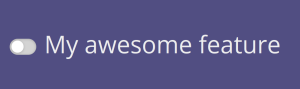
Of course, designers may not like the way this looks and we want to create a great looking custom switch. So let’s add a bunch of CSS:
input {
appearance: none;
position: relative;
display: inline-block;
background: lightgrey;
height: 1.65rem;
width: 2.75rem;
vertical-align: middle;
border-radius: 2rem;
box-shadow: 0px 1px 3px #0003 inset;
transition: 0.25s linear background;
}
input::before {
content: “”;
display: block;
width: 1.25rem;
height: 1.25rem;
background: #fff;
border-radius: 1.2rem;
position: absolute;
top: 0.2rem;
left: 0.2rem;
box-shadow: 0px 1px 3px #0003;
transition: 0.25s linear transform;
transform: translateX(0rem);
}
All the specifics of the styling here don’t matter as much, but I want you to take a look at that first rule: appearance: none.
Form elements, along with images, are something called “replaced content”. That means they’re not really part of your HTML, but supplied by the browser. When the browser renders your HTML and finds replaced content, it leaves a box for it, and then replaces that box with the actual content. This is why, for example, images and form elements can’t have pseudo-elements: they get replaced when the browser replaces the entire element.
`appearance` is a way of telling the browser to stop doing that. That lets you use the ::before pseudo-element. The input itself is now the background of our switch, and the ::before pseudo-element is the little dot inside of it that does the toggling.
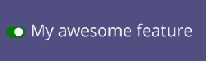
Clicking this still checks and unchecks the checkbox, but because we replaced the element we need to do the work of making that visible ourselves. That’s where the `:checked` pseudo-class comes in:
:checked {
background: green;
}
:checked::before {
transform: translateX(1rem);
}
When you click the checkbox, that `:checked` pseudo-class starts to match and that causes the styling to update.
So we have a great looking custom switch using native HTML elements and a bit of CSS, but we’re not done yet. While for mouse users it’s really clear which form control they’re interacting with (since they’re pointing at it and clicking), for people using a keyboard that’s not so easy.
I’m sure you’re familiar with this bit of CSS. To get rid of that ugly, dotted, boxy outline.
input:focus {
outline: none;
}
That’s not a good idea because it hides it for everyone, including people that benefit from it. But how do we make it look, well, nicer? Here too browsers have updated to make things better for us. The outline now follows the border-radius of an element, and we can also offset it away, or inside of, the element:
input:focus-visible {
outline: 2px solid dodgerblue;
outline-offset: 2px;
}
Now, when a user interacts with an element using the keyboard (you can try pressing the spacebar after clicking it, or tabbing to it), `:focus-visible` will match (it won’t when using a mouse) and they get a good looking, blue outline slightly around the element.

A native switch
Just to drive the point home of features moving from JS to CSS and HTML: Safari currently supports a new attribute on checkbox inputs called switch. When you set that attribute, it creates the switch style for you.
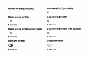
It comes with two new pseudo classes that you can use to style the track (the background) and the thumb (the white dot):
input::thumb {
/* … */
}
input::track {
/* … */
}
Or you can even set just the accent color and the browser will style it for you:
input {
accent-color: hotpink;
}
Dialog modals
Sometimes you need to inform the user about something, or ask them something or get them to confirm something. In JavaScript, that’s what alert(), prompt() and confirm() do. But they have a pretty big downside: they lock the main thread, meaning your page can’t do anything else. They’re also browser-native, so you can’t style them to work with your design.
Building your own dialog is also asking for trouble: you need to keep the focus inside the dialog for accessibility, announce it’s modal-ness, make sure users can’t exit it accidentally, and you’ll have to fight with whatever chat widget occupied the z-index of 2147483647 (if you know you know).
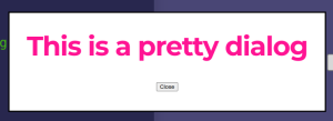
So that’s why browsers now come with a native dialog element:
<dialog>
<form method=”dialog”>
<h3>This is a pretty dialog</h3>
<button type=”submit”>Close</button>
</form>
</dialog>
This element isn’t shown by default and, for now, we have to cheat a little and use JavaScript:
document.querySelector(“button”).addEventListener(“click”, () => {
document.querySelector(“dialog”).showModal();
});
There’s changes in the works that will let you open dialogs without JavaScript, but they’re not fully specced yet, let alone implemented. For now, we need to use JavaScript to open the dialog. But that’s it, the rest is all native HTML and CSS.
The dialog element has a showModal() function that it exposes and with it, you open the dialog. This dialog is opened on something called the`top-layer, which is a new concept in browsers.
The top layer is a new layer that’s separate from your HTML, and you can “promote” elements to it. That means that elements on the top layer will always be above everything else, regardless of the z-index of an element and stacking context nesting.
You might notice that the browser doesn’t give you any UI. The dialog is pretty much a div and it’s up to you to provide the UI for closing. That’s what the form in the code above does. You might’ve noticed it has a method of “dialog”. When this form gets submitted, the browser takes that as a signal to close the dialog again.
The browser will automatically place the dialog in the middle of the screen for you, but everything else is up to you.
Dialog also comes with a new pseudo-element called ::backdrop. That’s the layer that sits between the dialog and the rest of the page, and you can style it to e.g. dim the rest of the page or otherwise direct a user’s attention to the dialog. For example, you can overlay a white layer and blur the page:
dialog::backdrop {
background: #fff5;
backdrop-filter: blur(4px);
}
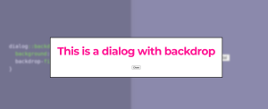
Just like the dialog element itself, the backdrop is positioned by the browser, so you won’t need to worry about scrolling, fixed elements and browser resizing. It’s all handled for you by the browser.
In closing
These are just two examples of features you no longer need JS for, but there are tons more. Just because you know something needs JavaScript, doesn’t mean it still does. You can make better websites if you test those assumptions every now and then. Happy coding!