

Oh how the internet has changed. Where it began with HTML, static pages with minimal to no styling to a platform that can do almost everything we do with computers. Maps, games, productivity tooling and of course websites. They are all still presented using HTML, CSS and JavaScript.
One major thing that did change is what kind of people are needed/working on these applications. Back- and front-end developers, designers, product owners, scrum masters, users, library owners, library consumers, framework authors. The list goes on and on. The reason is because the work became too big, too complex, for a single person to handle; at least in most enterprise areas.
People that work together rely on common knowledge and documentation in order to understand what needs to be done (Definition of ready) and when it is done (definition done). People communicate.
Communication
Human communication is based on a set of rules. The more you use the rules the better you are in understanding the complex task at hand. The more you use and repeat the better you get at it. This process is of course called learning. Learning a new language is all about understanding the rules of that language. You also need to be able to properly translate the nuances of that new language to your inner language in order to understand the true meaning of what is communicated, the delicate process of nuance.
Listening to a person (input) and talking to someone (output), but also reading (input) and writing (output) are based on the language rules and both involved parties will greatly benefit from understanding the rules the language and the rules of communication (it’s not polite to interrupt a person).
APIs
These same rules apply to computer communications. If a website want to know the inventory of a store back-end it needs to know what it should request and what to expect (response). These communication rules are called APIs, Application Programmer Interfaces. The more the consuming application knows about the rules of the providing service, the better. As developer you can define these rules yourself, but that makes it harder to have other systems integrate with your system since your rules might differ from the standards. A custom API is your own secret language.
An example of a defined standard for Restful APIs is called OpenAPI which defines a document that lays down the rules of the application like the version (soft of dialect) the security measures, the URLs, the paths and components to use.
Everything the consuming application needs in order to properly communicate to and from the given application.
UI Components
The same could be said for UI components. UI components used to be a part of the same system as the UI but that has changes a lot in recent times. Large companies use a design system to lay down the rules for how UI components need to be used, others provide a component library for others to use; material UI from Google for example. In both cases the team responsible for the component is not responsible for the UI of any or all applications that are built using those components.
Design first
Applications evolve and so do their APIs. A team could start with building the basic application and offer that to other teams but they can also sit down with all involved teams and team members to think about the API first. Think about what the best way is to provide and consume data from both sides of the API. The latter approach is called design-first and offers a way where stakeholders don’t have to wait on an implementation before they can start work: all involved parties know what they can expect and what they need to deliver. Using tooling that is available, since the API is based on a standard, stakeholders can verify their work without any implementation!
Is a design-first approach possible when it comes to UI components? Let’s find out!
Framework agnostic
One important thing that needs to be addressed first is that if the UI components can be consumed by other teams is that these components need to be framework agnostic. The component team is not responsible for making the choice which framework suits best for a given application. Even if both teams use the same framework it can still be problematic if the component is written in an older, or newer, incompatible version of the same framework.
This is where web components come in. Web components is a relative new addition to the browser platform and allow authors to create their own HTML like tags, called custom elements. Custom elements can be recognized because they have a dash(-) in their name like my-element, hello-world or trsit-date-picker. A powerful (but also sometimes problematic) part of web components is the shadow-dom which is a separated document object model that “hides” the dom from the outside (now called light-dom). Most styles and logic can leak out, but also can’t leak in. Perfect for the cases where your design system dictates a padding or some specific colour.
Web (components) API
Since web components are part of the browser platform they follow the exact same rules as all HTML elements do. Input is handled by properties and slots (a way to control the placement of light-dom elements within a web components), output is managed by firing and listening to events. For styling CSS is used and part of the CSS spec are CSS variables that can be set and overridden from the light-dom.
This all means that web components have a very predictable API, which we can use to our advantage: OpenAPI for web components; or Custom Elements Manifest.
Custom Elements Manifest (CEM)
Many tools need some machine-readable descriptions of custom elements: IDEs, documentation viewers, linters, graphical design tools, etc.
Custom elements manifest is an effort to bring together tool owners to standardize on a common specification for a description format.
CEM analyser is one of tools that use CEM and acts as an analyser for web components. Standard JavaScript and vanilla web components are supported by default. Dedicated web component libraries can be supported through the use of plugins. Support for Lit, Stencil, Fast and catalyst is currently available.
Although not pure design first, but by creating a skeleton component we can use CEM analyser to generate the CEM which can then be used for further tooling. Of course it is also possible to write the CEM first; true design-first and use it to generate the skeleton component.
Skeleton components
A skeleton component holds just enough information to properly define the API but nothing more. Don’t implement styling beyond the CSS variables, don’t add visuals that are not part of the API. This skeleton is your base UI component. What needs to be done though is: Define slots, events, properties and CSS variables, in other words: define the API of the UI component.
Create the skeleton component
In this example Lit is used, but any of the web component libraries supported by CEM analyser can be used.
import { html, css, LitElement } from ‘lit’;
import { customElement, property } from ‘lit/decorators.js’;
@customElement(‘hello-world’)
export class HelloWorld extends LitElement {
static styles = css`
:host {
display: block;
background-color: var(–background-color, white);
}
p {
color: var(–text-color, black);
}
`
@property()
type = ‘wonderful’;
private fire() {
this.dispatchEvent(new Event(‘🎁’));
}
private fire2() {
this.dispatchEvent(new Event(‘💣’));
}
render() {
return html`<p>Hello ${this.type} world</p>
<p>
<button @click=${this.fire}>👆</button>
<button @click=${this.fire2}>👇</button>
</p>`;
}
}
This will result in

With 1 property type, 2 events: 🎁 and 💣 and 2 css variables: –background-color and –text-color.
This is actually enough for CEM analyser to generate the CEM but without any human readable comments. To improve the CEM JavaScriptDoc can be used, let’s add some!
import { html, css, LitElement } from ‘lit’;
import { customElement, property } from ‘lit/decorators.js’;
/**
* @cssprop [–text-color=black] – Controls the text colour
* @cssprop [–background-color=white] – Controls the background colour
*/
@customElement(‘hello-world’)
export class HelloWorld extends LitElement {
static styles = css`
:host {
display: block;
font-size: 2em;
padding: 1em;
background-color: var(–background-color, white);
}
p {
color: var(–text-color, black);
}
`
/**
* What type is the world today?
*/
@property()
type = ‘wonderful’;
private fire() {
/** @type {Event} gift – I’m bearing a gift */
this.dispatchEvent(new Event(‘🎁’));
}
privatefire2() {
/** @type {Event} bomb – This was a mistake… */
this.dispatchEvent(new Event(‘💣’));
}
render() {
return html`<p>Hello ${this.type} world</p>
<p>
<button @click=${this.fire}>👆</button>
<button @click=${this.fire2}>👇</button>
</p>`;
}
}
All lines that start with /** are treated as comments and by using the JavaScriptDoc annotations helpful text is added, directly in code, which is read by CEM analyser.
After running CEM analyser the CEM is generated from this skeleton component; now comes the fun part: using this API doc!
API viewer/explorer
<api-viewer> is a web component that read the CEM and uses it to visualize the API
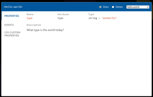
On the left hand side the input/output is grouped by types: properties, events, slots, CSS variables, etc. Each tab shows the instances of that tab; in the example above the properties are shown, including the human readable comments that were added.
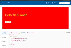
But why stop there? The component is fully operational and just like for example storybook it’s possible to change the knobs of the component:
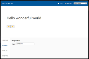
Change some settings and the updated state of the component is reflected in the source tab:
Tip: let the analyser run after each commit to keep the CEM 100% up-to-date. Up-to-date documentation and interactive playground within seconds!
AaaG
…but why stop there? The beauty of using a standard is collaboration, not only within a team or company but in a whole ecosystem. Developers and teams from all over the world can use CEM to add more tooling which can be used, regardless of what framework is used for the rest of the application.
- Interactive demonstrations
- Linting
- Testing
- Cataloguing
- Integrations
- Documentation
- …
Automation as a Gift.
AaaG examples
- CEM-to-markdown used CEM to create a markdown file holding the API of the actual state of the UI components; ideal to be added to the GIT repo or documentation site.
- cem-plugin-reactify will create react < 19 wrapper components for the custom elements.
- custom-elements-vs-code-integration will generate the integration json files needed to fully support the custom elements in VS code.
- Storybook has native support for CEM
Getting started
To get started here are some great resources:
- dev (web component library)
- custom-elements-manifest.open-wc.org (CEM)
- custom-elements-manifest.open-wc.org/analyzer/plugins/intro/ (AaaG)
Wrapping up
Human communication is based on a set of rules. The more you use the rules the better you are in understanding the complex task at hand. The more you use and repeat the better you get at it. This process is of course called learning. Learning a new language is all about understanding the rules of that language.
Applications evolve and so do their APIs. A team could start with building the basic application and offer that to other teams but they can also sit down with all involved teams and team members to think about the API first. Think about what the best way is to provide and consume data from both sides of the API. The latter approach is called design-first and offers a way where stakeholders don’t have to wait on an implementation before they can start work.
Web components is a relative new addition to the browser platform and allow authors to create their own HTML like tags, called custom elements.
Many tools need some machine-readable descriptions of custom elements: IDEs, documentation viewers, linters, graphical design tools, etc.
Custom elements manifest is an effort to bring together tool owners to standardize on a common specification for a description format.
Although not pure design first, but by creating a skeleton component we can use CEM analyser to generate the CEM which can then be used for further tooling. Of course it is also possible to write the CEM first; true design-first and use it to generate the skeleton component.
The beauty of using a standard is collaboration, not only within a team or company but in a whole ecosystem. Developers and teams from all over the world can use CEM to add more tooling which can be used, regardless of what framework is used for the rest of the application. True Automation as a Gift.